It’s long time that I want to write an article about the evolution of our webpage and today I want to do it to celebrate the 7th edition of our presence online.
Lot of time has been passed since PlaySys adventure started, many adventure happened and our website tried to follow and reflect our skills and personality. The word “tried” is mandatory because sincerely it took 4 years to obtain a webpage that was able to satisfy my taste: only in 2011 I was proud to show it publicly. But let’s proceed with order, since the beginning…
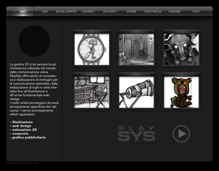
Once upon a time, in 2007 we had a funny-terrible-looking page, constructed with Dreamweaver in some days by the first team of PlaySys.
The problem was not the team’s skill, for sure not enought for web development, but the childish taste in the design. We used a very popular glossy style for the menu and a videogame user interface style for the layout. Also the logo was not respected at all, but it was our first web page, we started with lot of passion in doing and less interest in the appearence. The website was sliced with Image-Ready, I still remember hundred rulers and table aligment with Dreamweaver…a nightmare ;)
In 2008 we changed the style and the result was probably worse:
Flash based website developed by an external freelancer. Nothing to say about it, I was simply very unhappy about the result but we were too much involved in production of magazines and 3d renders to manage it…and also we were demotivated because of the lack of quality delivered by professionist.
In 2009 I decided to try again the experience with an external freelance support, so I asked to proven professionists (copywriter and communication specialist) to support us in the development. The result was even worst than worst and also I had to spend time with my internal co-workers to fix the problems. Even in this case I have nothing special to say: delusion and frustration for that minimalistic idea tranformed in empty design in change of an unproportional payment –> trashed money.
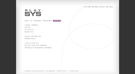
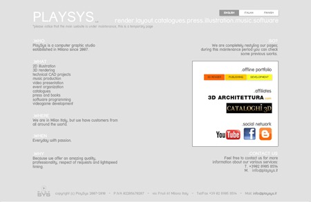
2010 was good and we had our first vesion of something for PlaySys website. No “WOW!” effect, I know, but at least it appeared like a website and not like a flyer. I decided to use “who, what, where, bla bla” in one single layout. I was bored of dark interface, acqua or glossy style: I wanted something flat, with low contrast capable to describe it all without images. I really liked the idea of selling images without showing them directly on the web page. Also from that version it was possible to download 3 different .pdf for our main production areas: 3D, publishing, software development. Nothing more, nothing less, simply clear and direct.
In 2011 we had the idea of renewing the website, changing completely the concept: selling the images showing them. The idea was better accepted by the market (even if I still like the idea of not showing the product) :)
This website was winning solution and remained for two years. It was enterely developed in Flash and we developed another html version for mobile devices, very lite to load but with same taste. The index.html was converted in index.php with a simple script able to identify the browser and deliver the proper website version. 
This year we have a new website, the previous one was ok, but I wanted to update the experience with better descriptions. Now we have sections and this raise the risk of writing too much. We do many things, from 3D (render, still, animations), publishing (both online and printed press), training (in schools, writing books and articles, publishing videotraining), software (plugins, videogames, realtime applications, mobile App), audio (music production, dubbing commercials)…I mean: too much for a web site.
For this reason the website now is an aggregator of the various production areas. Actually you can give a look at 3DArchitettura, but we are working on other surprises ;)


0 commenti:
Posta un commento